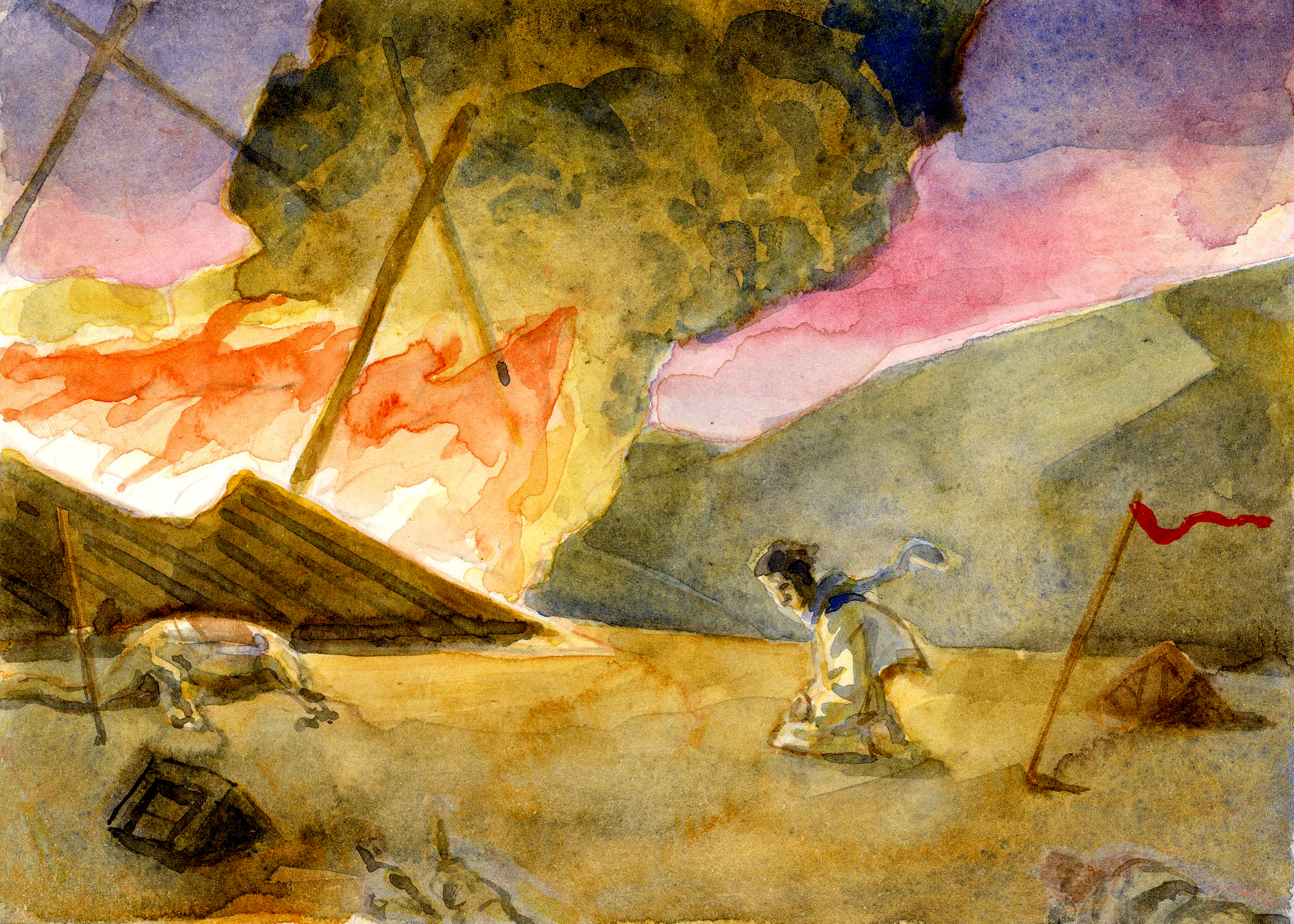
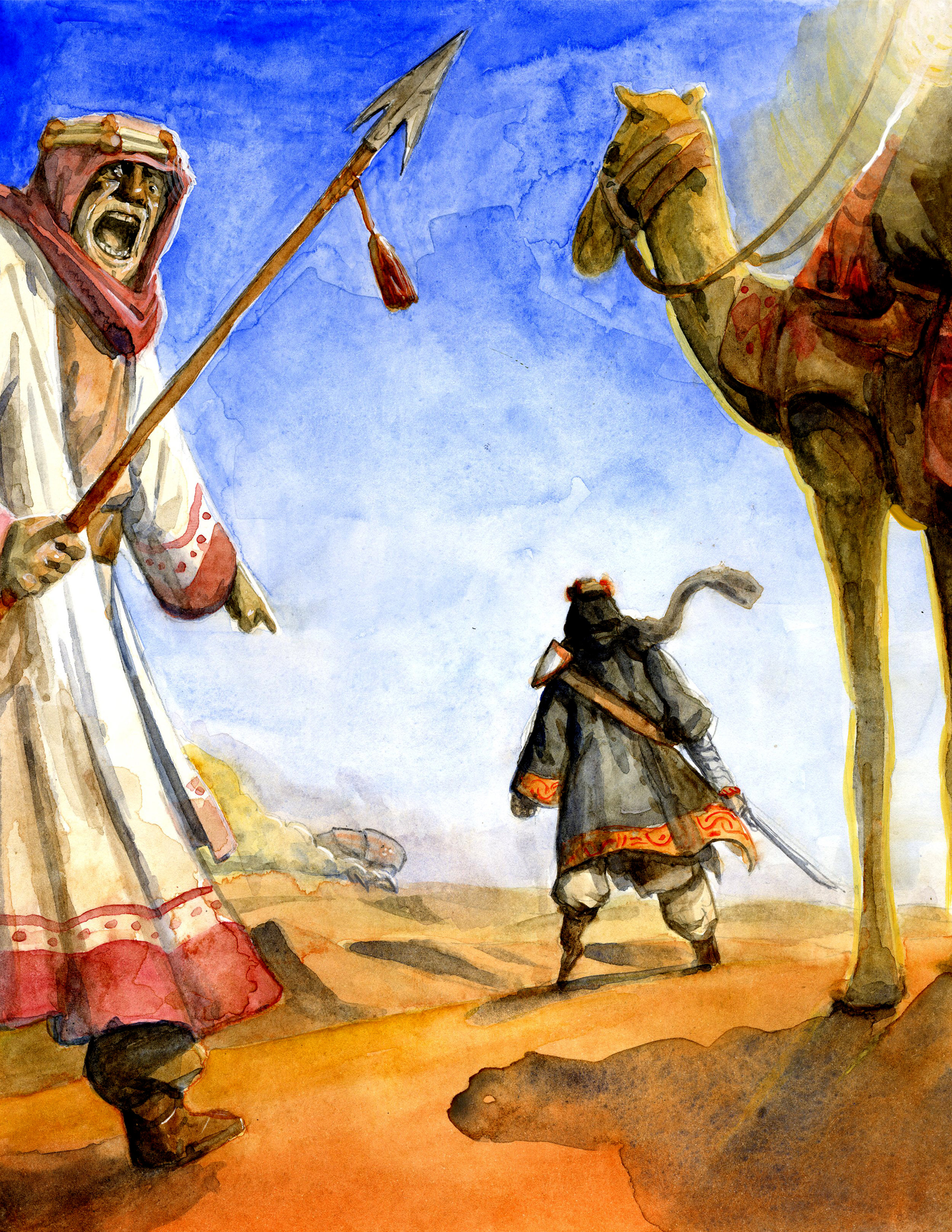
Sophomore year is in the bag, and I got some art to show for it! My biggest final this semester was for Character Design II taught by Tom Bancroft. Character Design I was primarily focused on the basics of design like shape, size, and variety. Character Design II was more geared toward composition, staging, and storytelling, building on the basic principles of the previous class. So, it was challenging, but really good for my brain to think in terms of making a dynamic and readable pose, as well as conveying an interesting story.
Our assignment for our final was to take an old classic, copyright free story, and basically repackage it. Meaning, revamp the idea, place the story in a different time period or setting, and add our own little twist to it. The final product had to include a colored lineup of 4-6 characters (along with development sketches), 3 black and white or colored illustrations, and a cover illustration. So, with 3 weeks to do all of this, I had to get cranking.
First, I sat.
And fiddled around.
I had to come up with an idea. What story would I want to devote my next couple of weeks to? I struggled to find a story that hadn’t already been handled by far better illustrators than me or sounded interesting to draw. With the amount of work that the final required, I wanted to make sure that it was fun to draw, or else it would get really old really fast. I considered doing Fahrenheit 451, The Book of Three, Le Morte D’Arthur, but none of those really excited me. Then, I thought about Moby Dick. I’ve never read it, but from what I knew about it, there were intriguing characters and I’ve always loved open seas adventures. That definitely sparked some excitement. Then, I had an epiphany that sealed the deal for me. What if I did Moby Dick, except in the DESERT? It seemed like it could translate well, because the ocean is just a water desert. Doing it the desert would let me play with a lot of fun ideas costume-wise and set-wise. I was hooked. Step one was done. I had a path.
The next step was research. No drawing yet, just learning the story, characters, themes, and mulling over the look and style. This is a reference sheet I put together with some of the many pictures I collected during this stage.
I love Lawrence of Arabia. It’s a magical movie. The scope and the epic windswept spirit of it is just wonderful. So I used that as a starting point, which is pretty apparent when you see my final designs. I also watched Tremors, starring Kevin Bacon, on Tom’s recommendation… I guess I got to see Kevin Bacon, but there’s not much positive to say about that movie. After collecting several folders of reference pics, I began sketching.
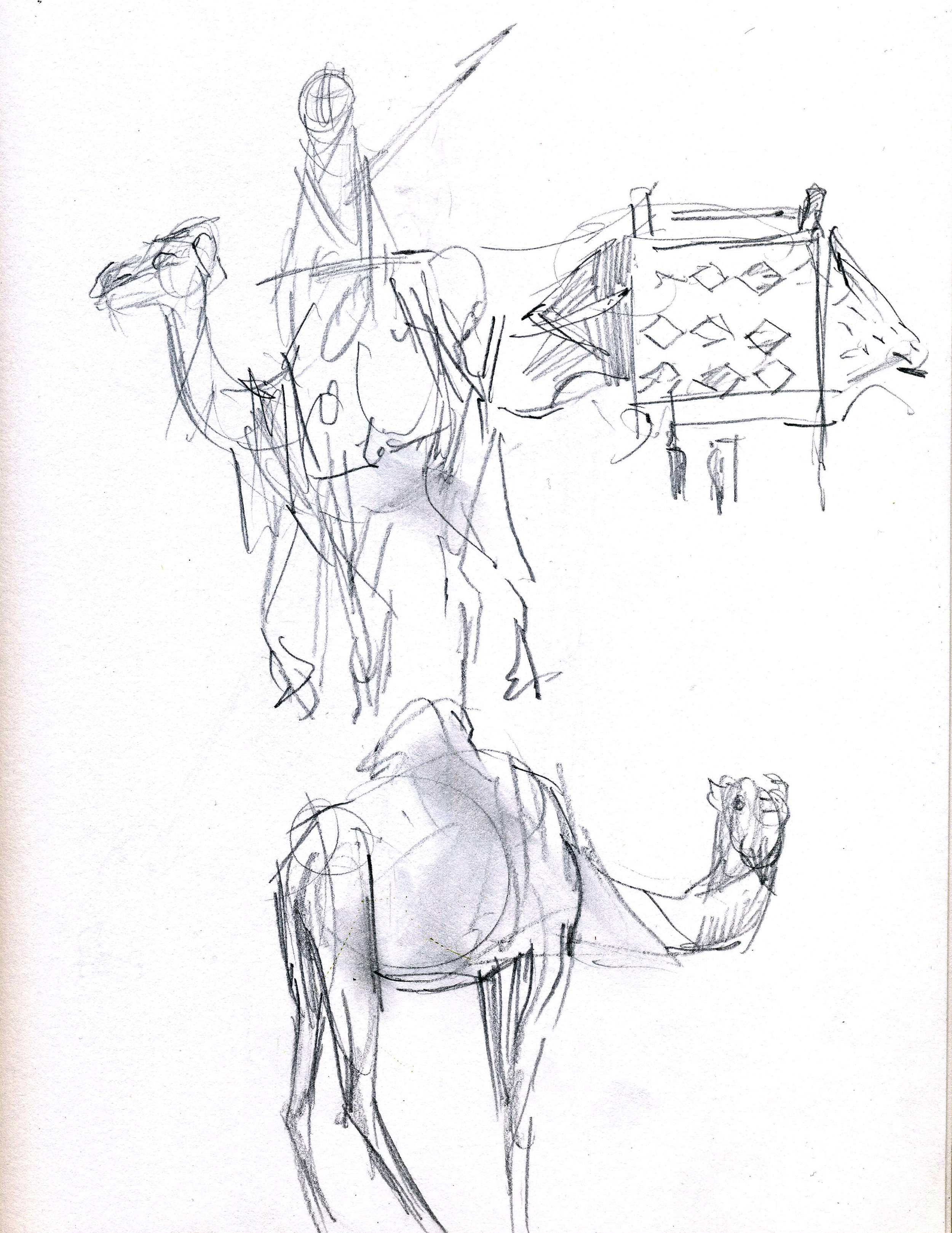
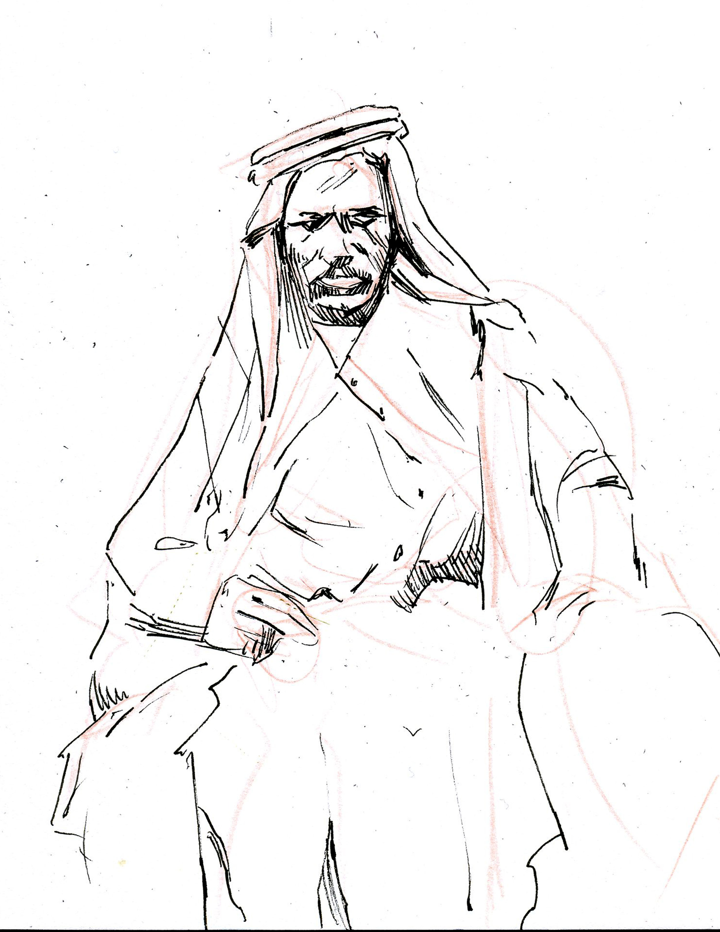
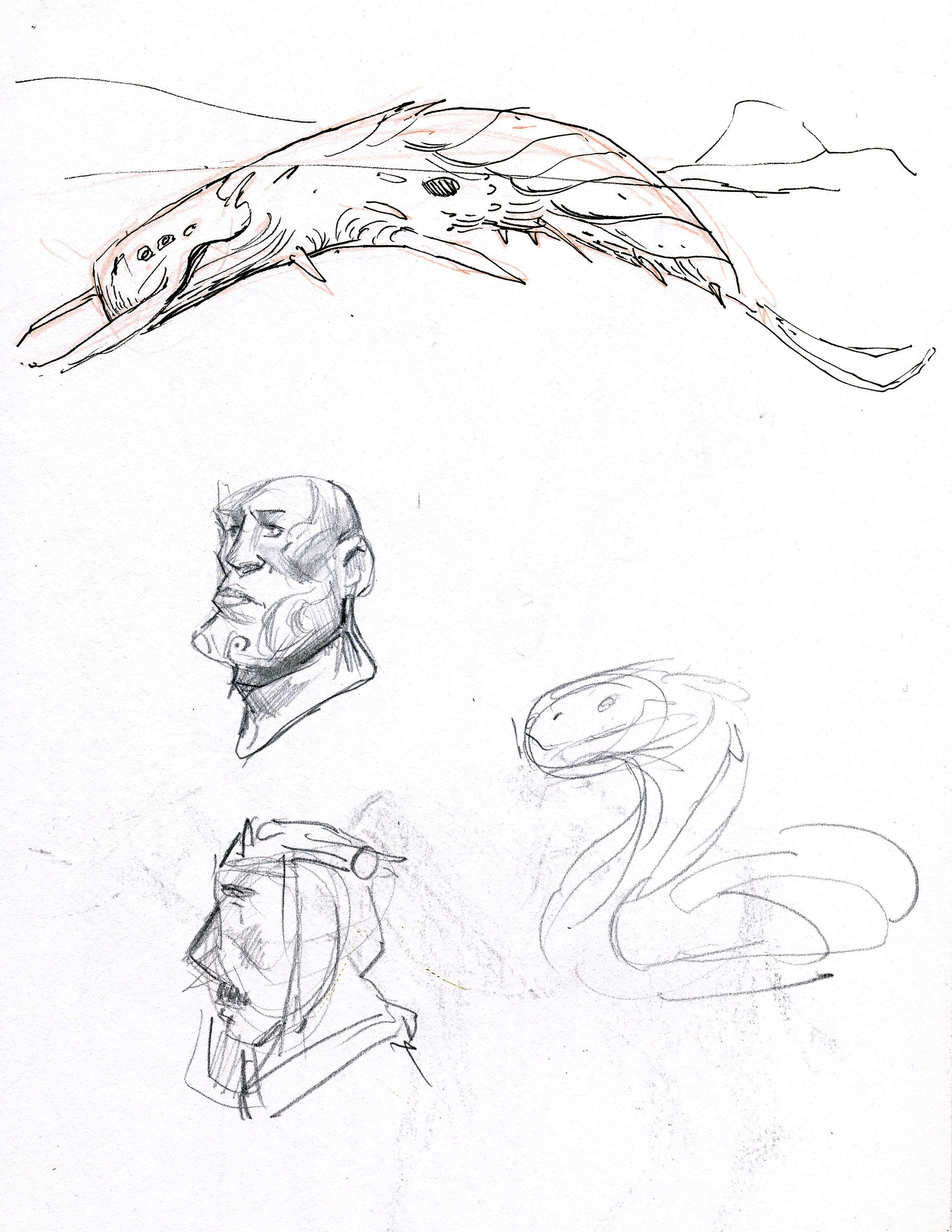
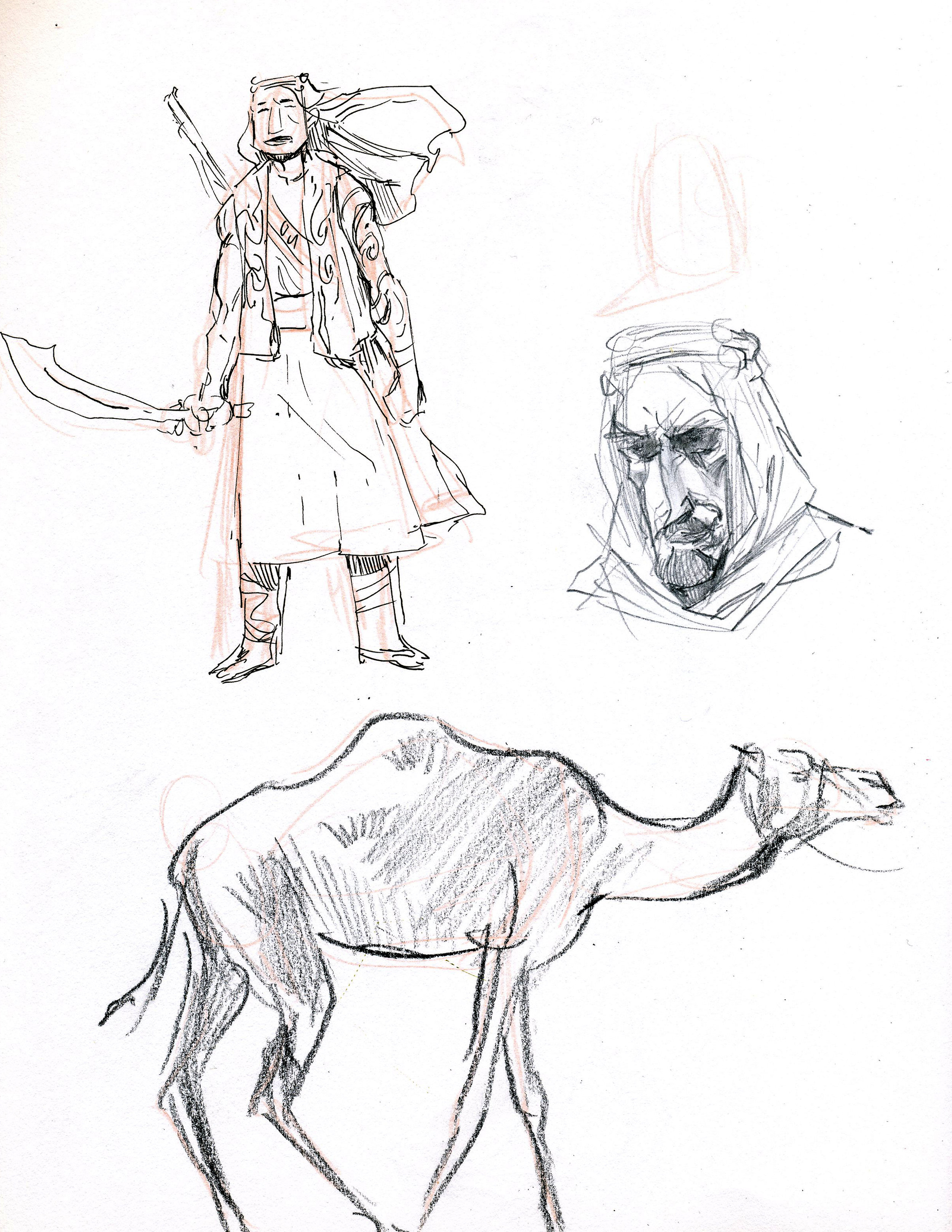
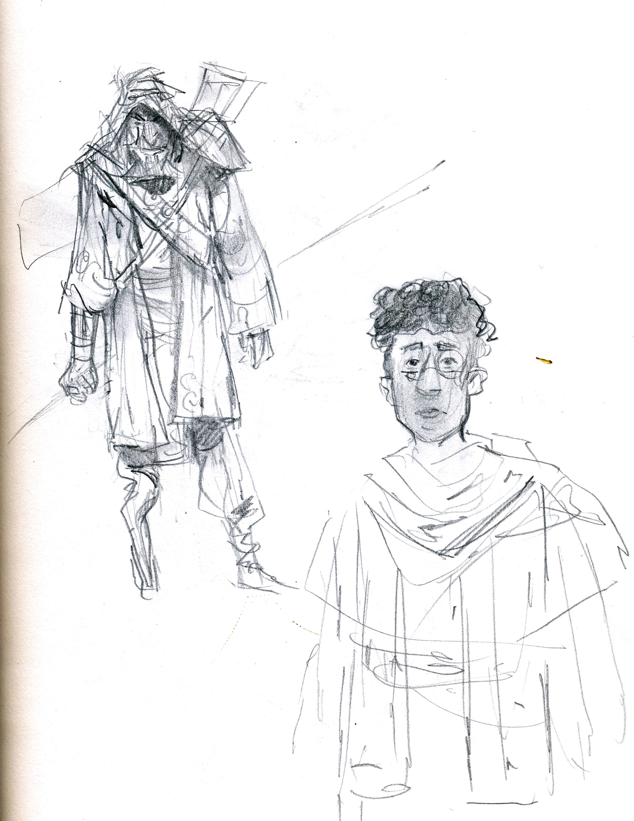
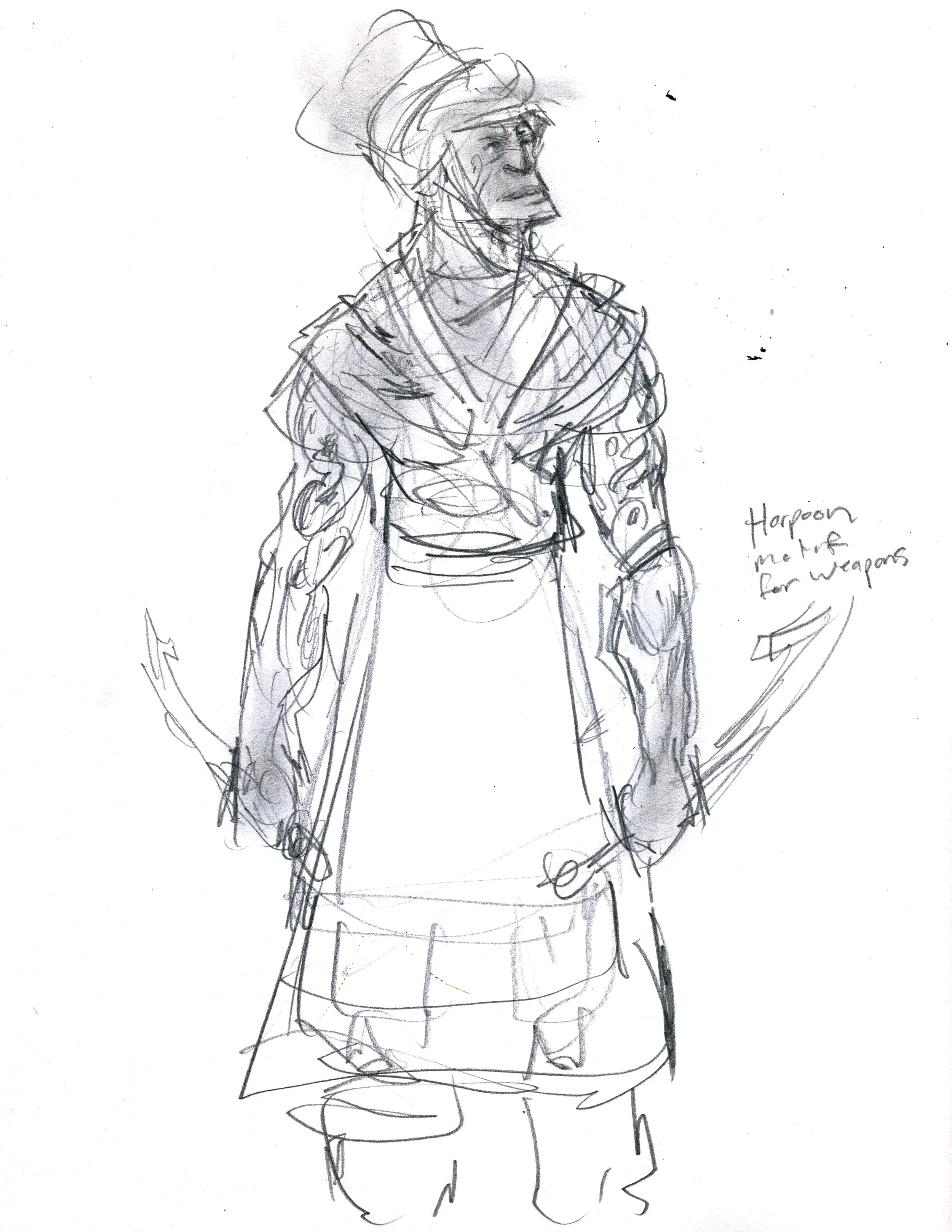
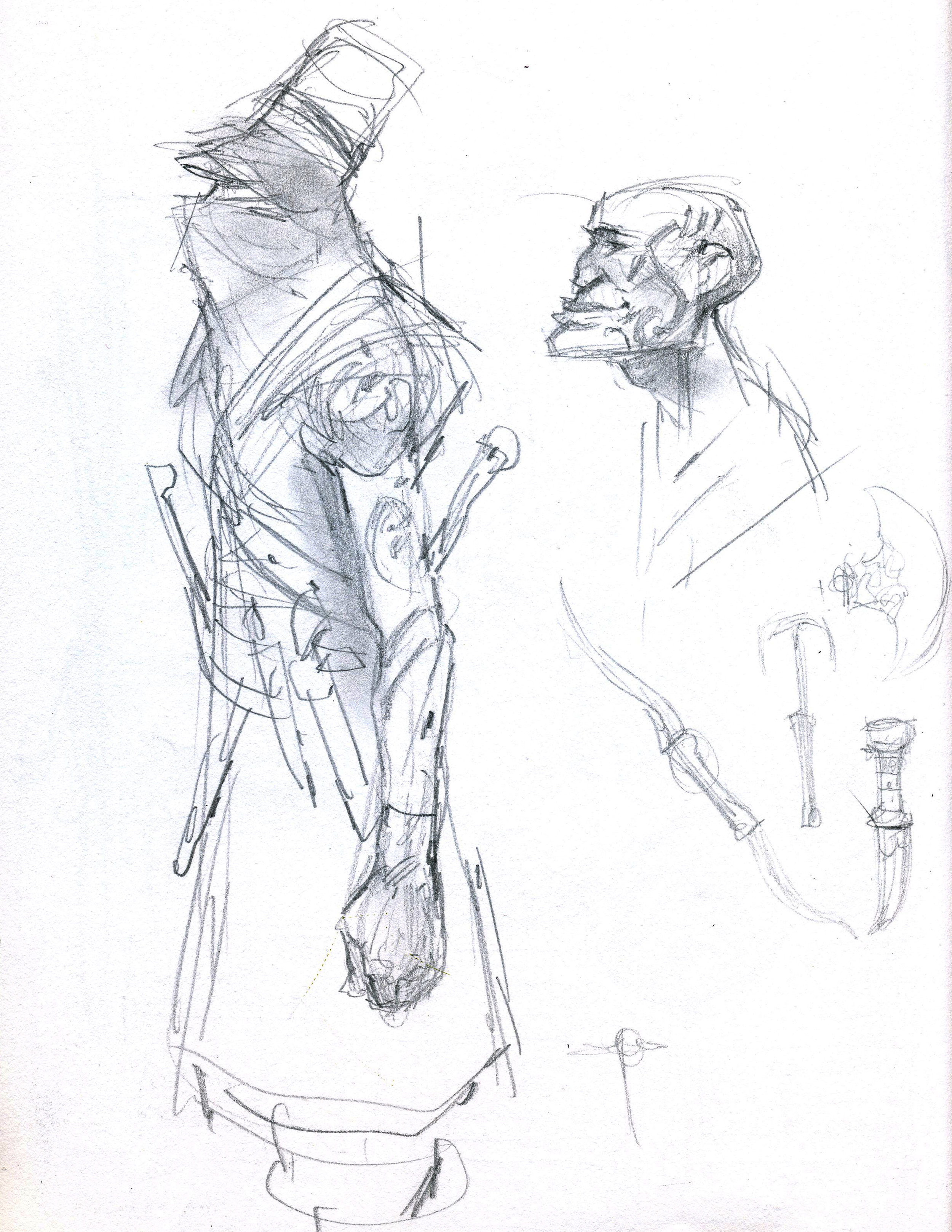
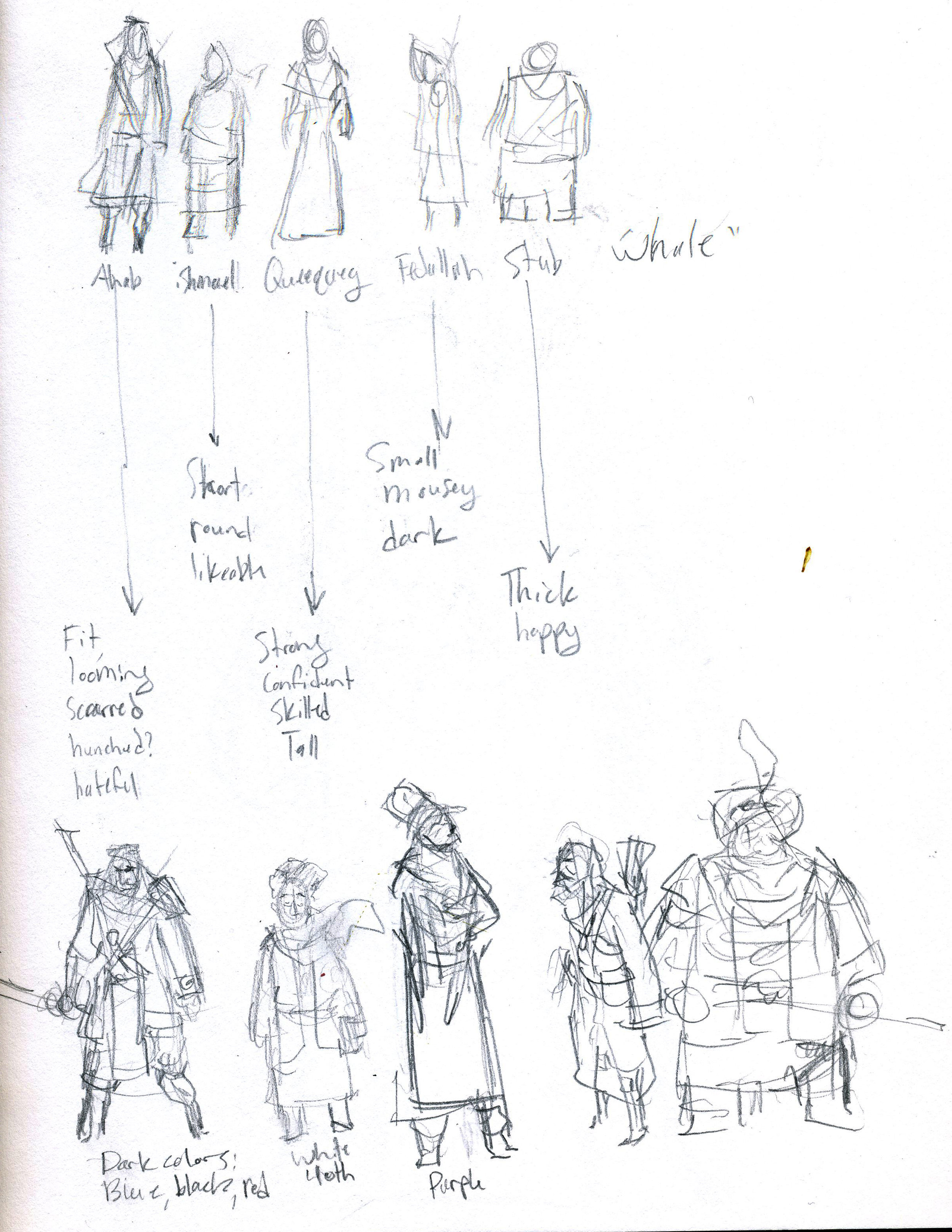
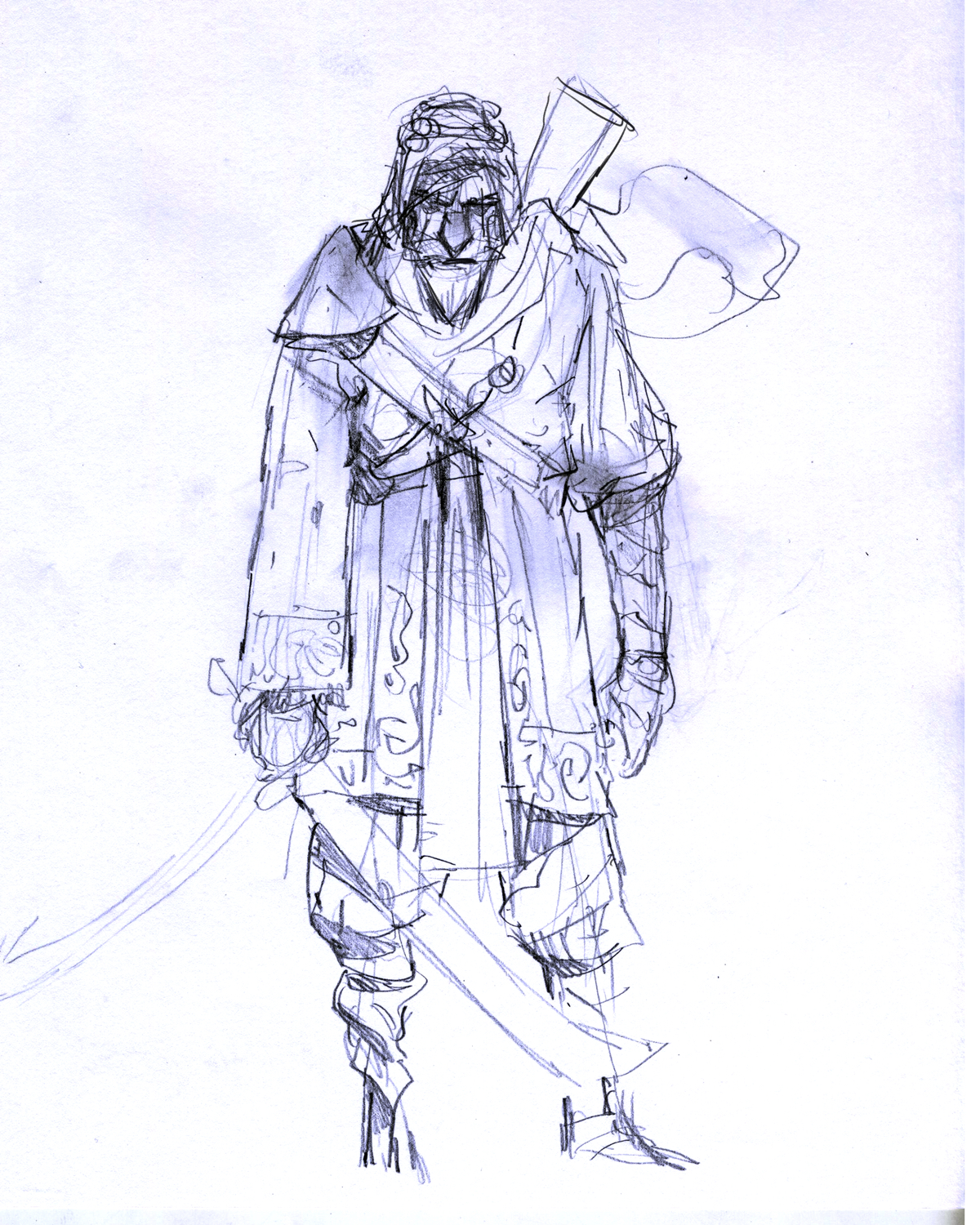
This stage is a mix of doing studies and just playing around. These are super loose drawings because their only purpose is getting as many ideas as possible out of my head and on the page. I did a lot of these; just figuring out how this world worked. Was it a literal sand whale, or is the whale even necessary? What kind of weapons would they have? How do they travel? All these questions are slowly answered in this stage. Here are some pages from my sketchbook:
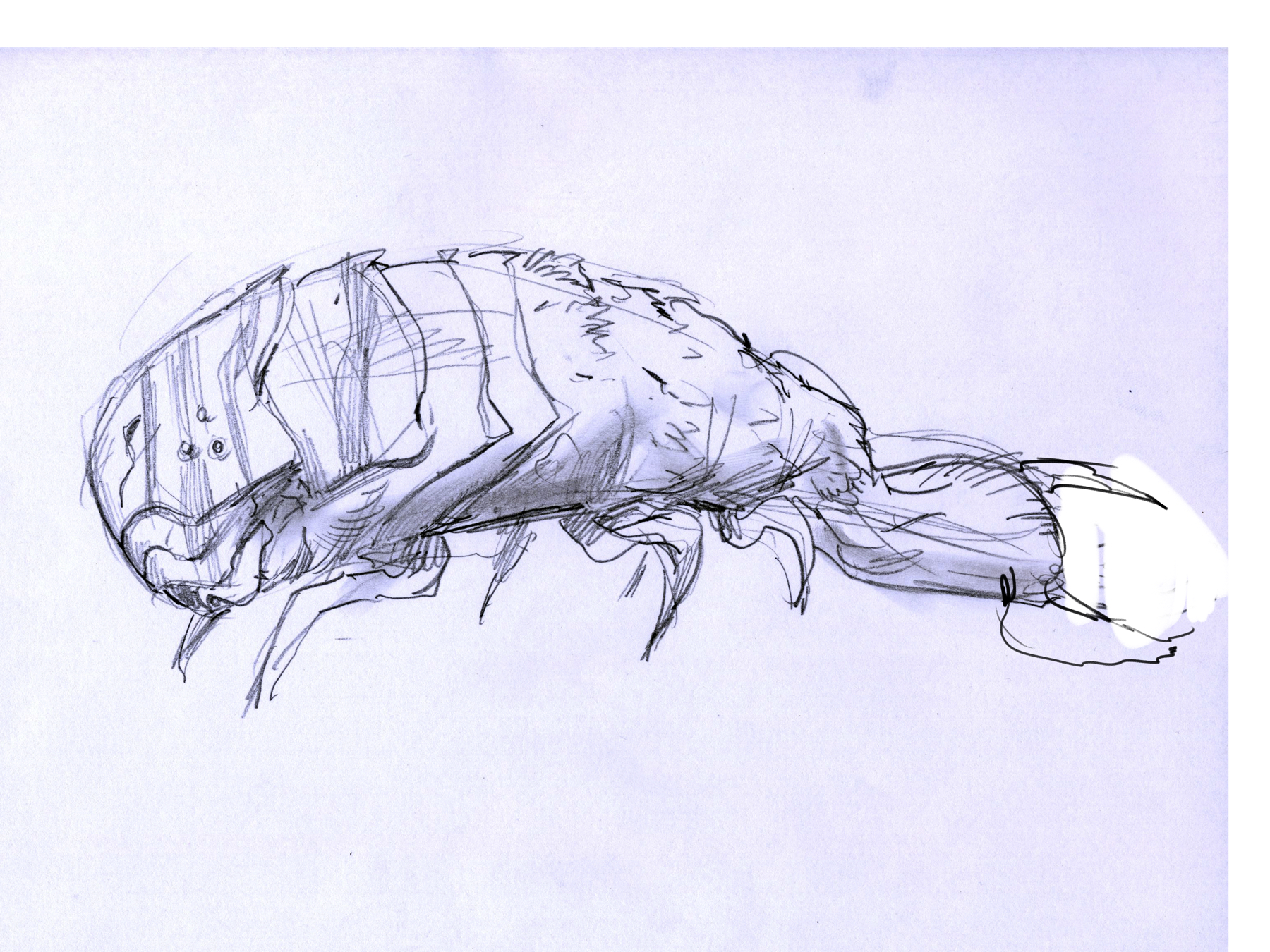
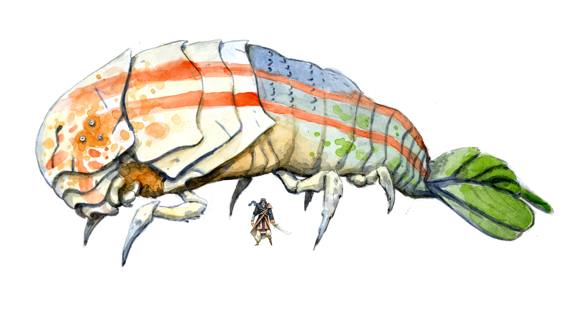
The design of Moby fell into place fairly quickly. I remembered a bug called an Ant Lion that my brother and I would catch when we were kids. It creates little funnel shaped traps in the sand which bugs fall into, kind of like the sarlacc pit. It had a crazy shape, so I took that, slightly modified it, and combined it with elements from crawfish to turn it into a gigantic sand whale.
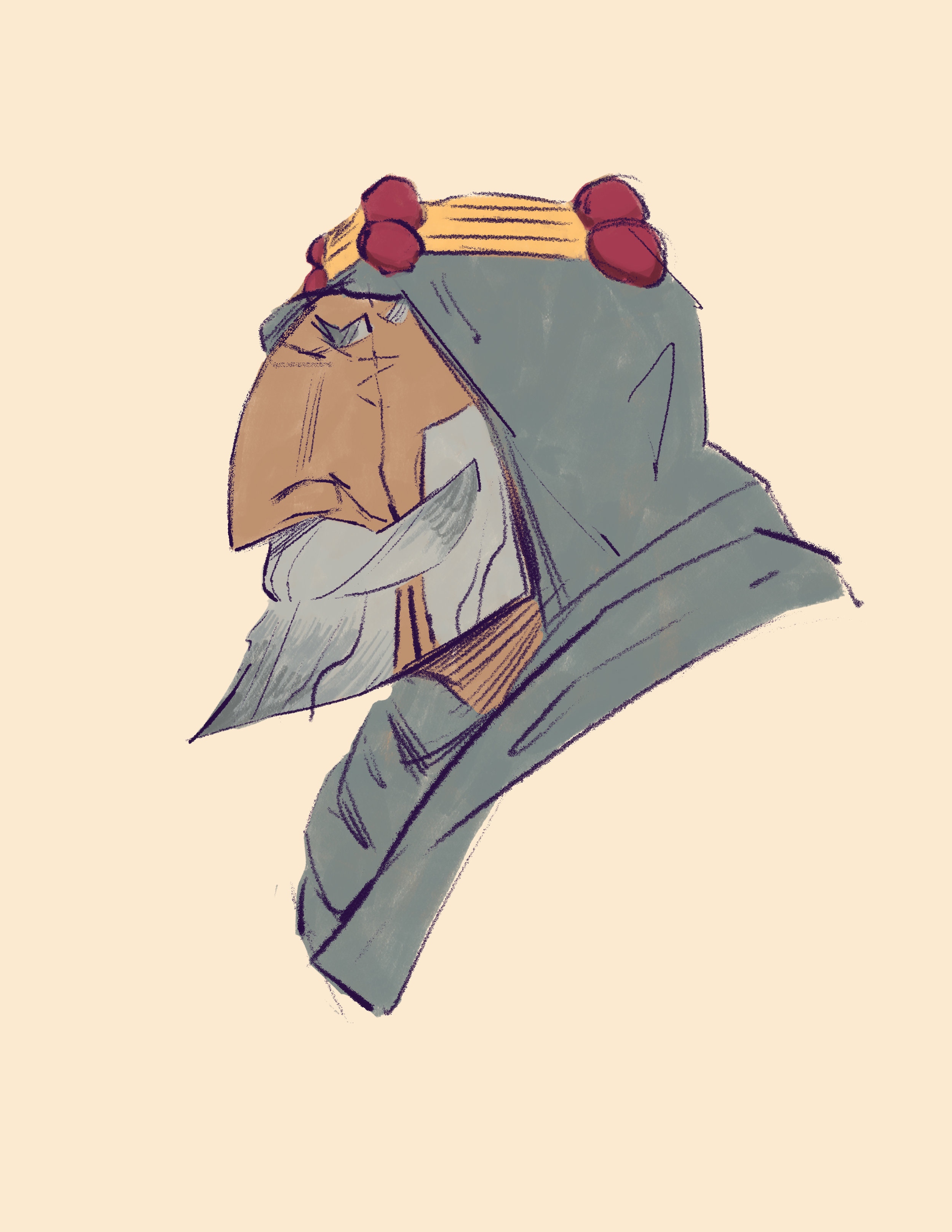
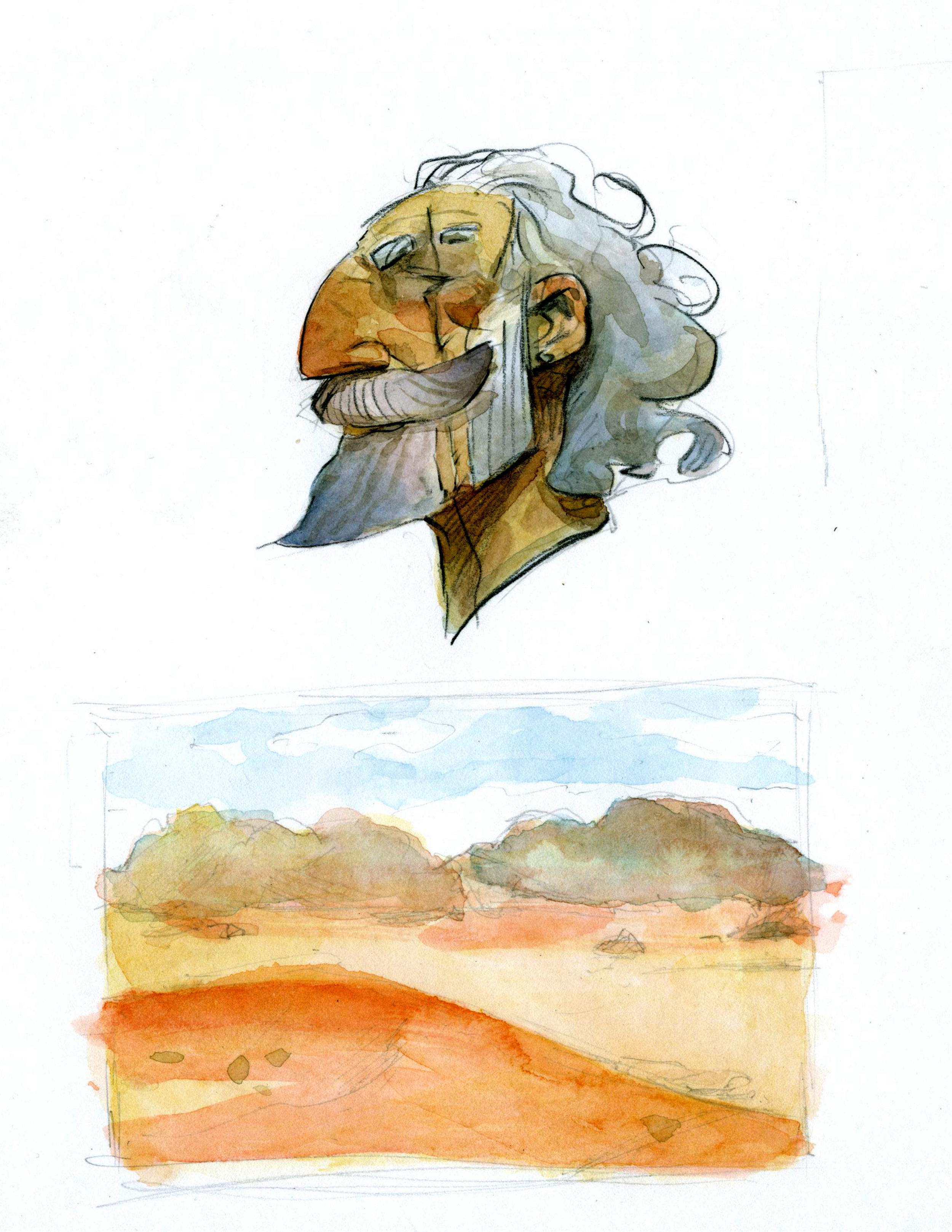
I also did some color studies to figure out how to execute the finals. I went back and forth between digital and traditional, there are pros and cons to both, but eventually went all traditional. It just felt like watercolors would best serve to capture the feeling I wanted to capture. Below is the digital then the traditional.
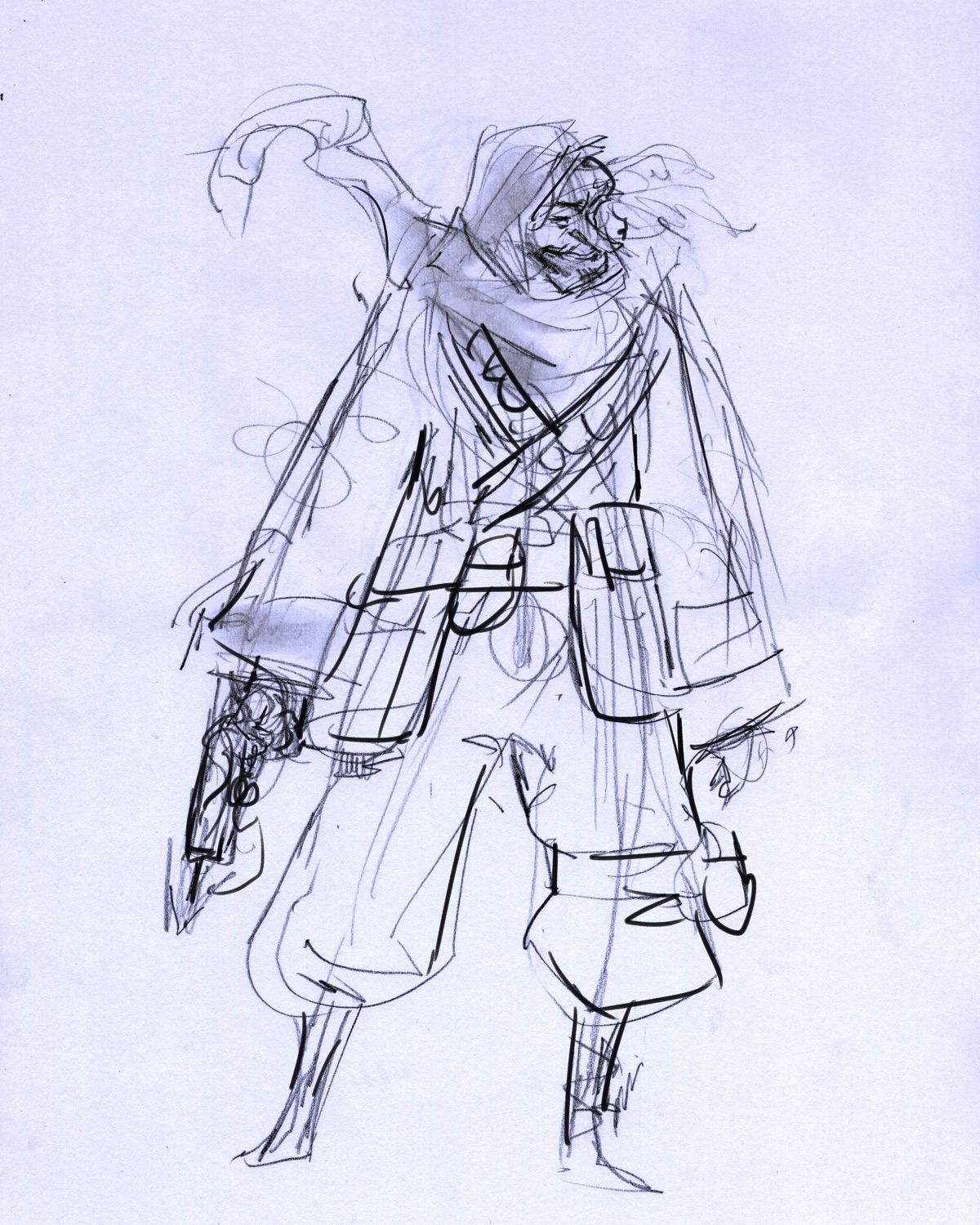
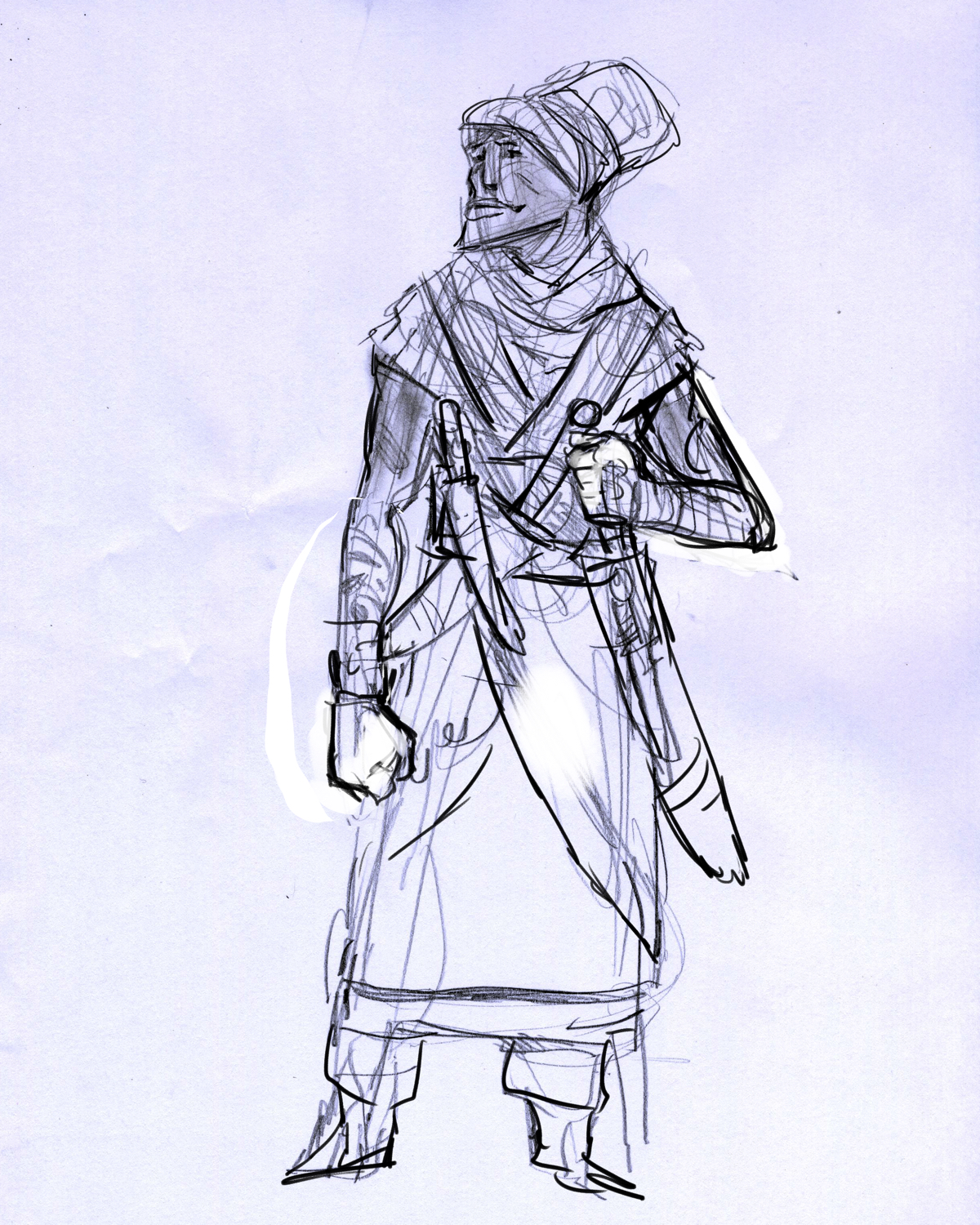
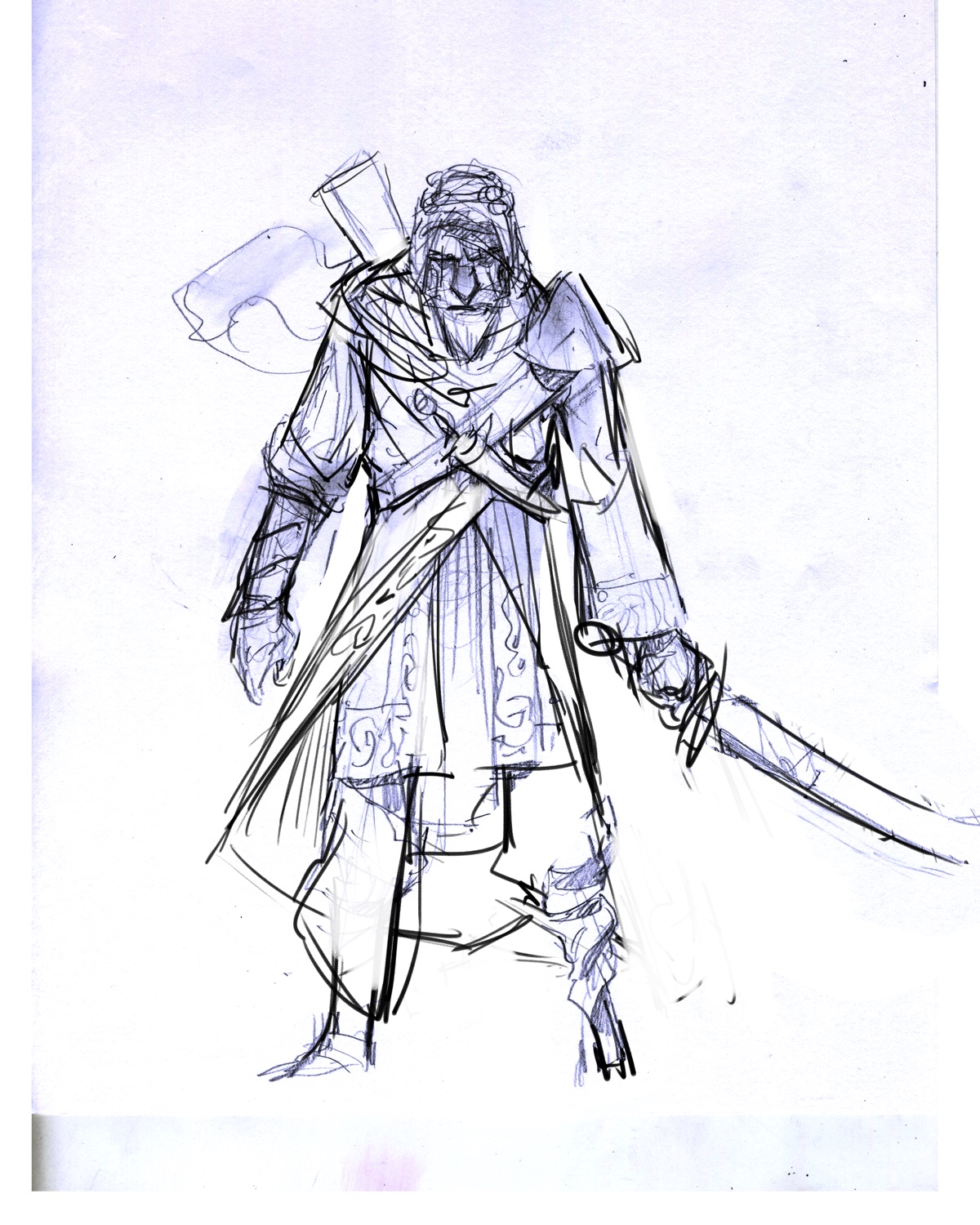
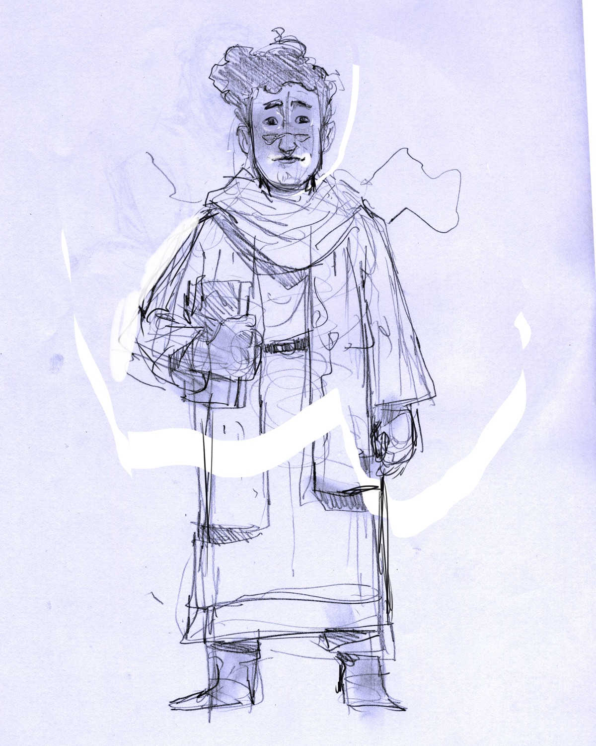
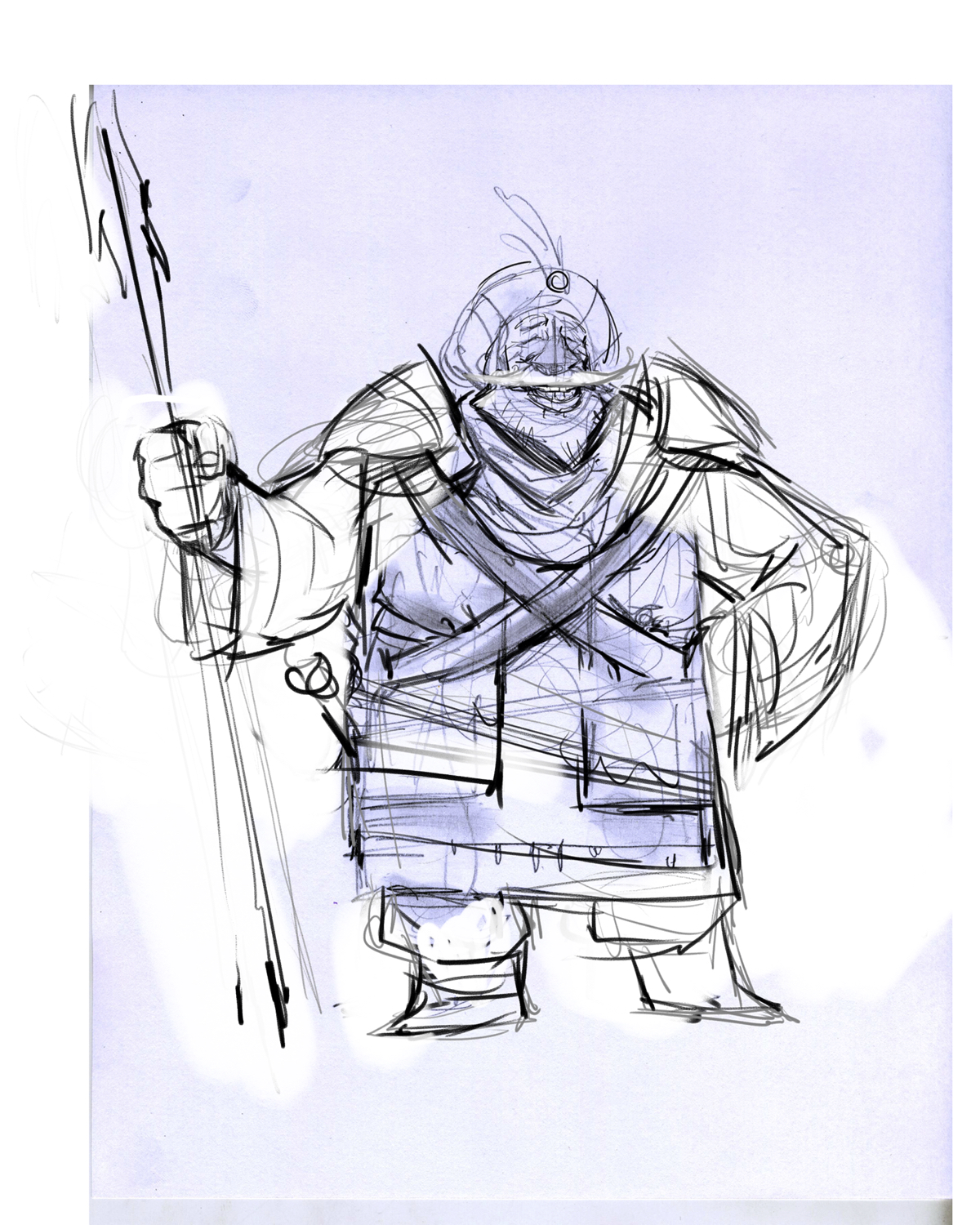
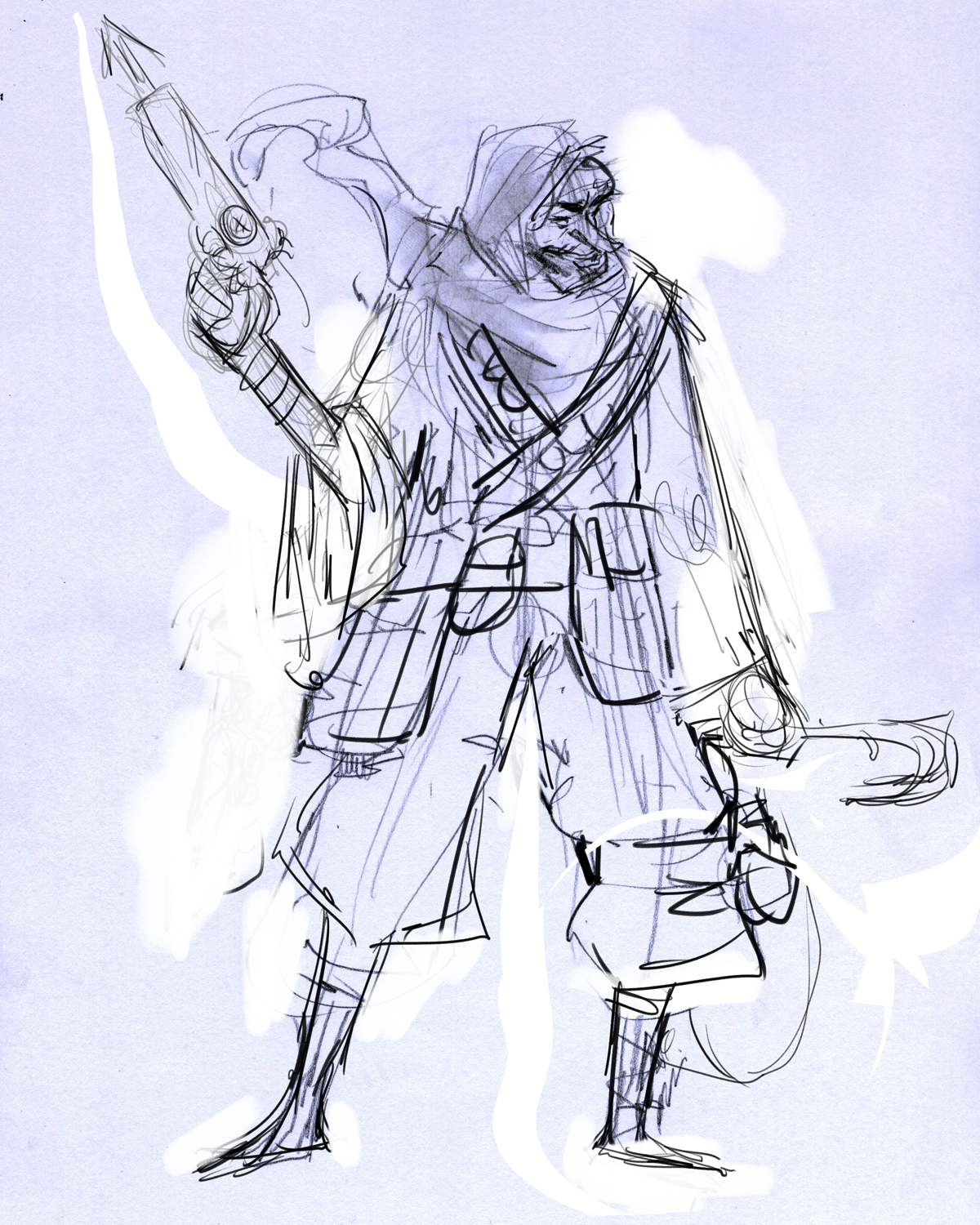
Next came the line up. I had all the characters in picked out and mostly designed, it then came to the point where I just needed to pose them and get started on the watercolors. Below are the first passes of the some of the characters.
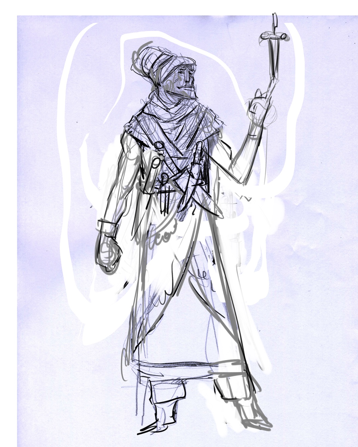
I ran these by my good friend Daniel, (check out his blog at https://wayfarersroost.blogspot.com ) and his main critique had to do with a lack of strong silhouettes and posing. Design wise, I felt pretty good about the characters, but I agreed that needed to push the posing, so I landed on the following:
I felt a lot better about them after the revisions. They felt more real, more alive.
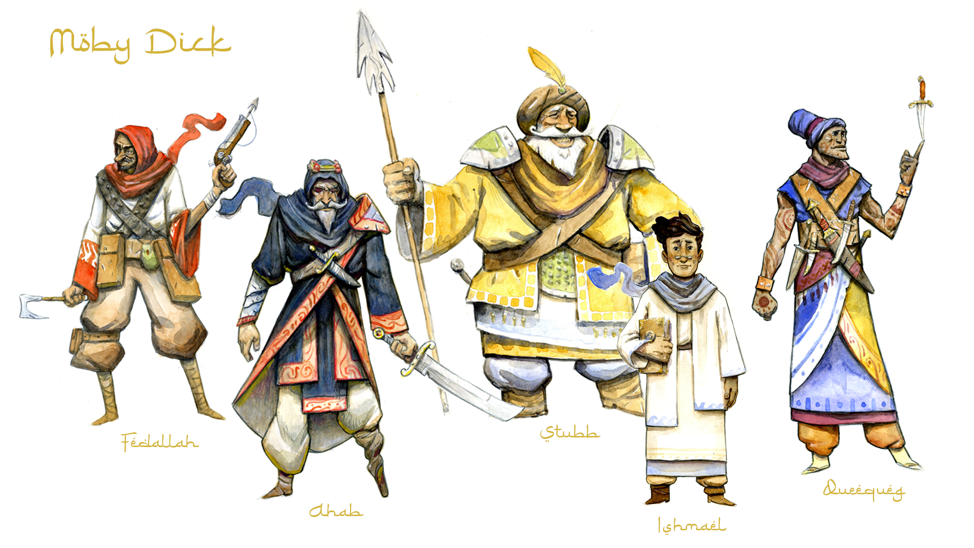
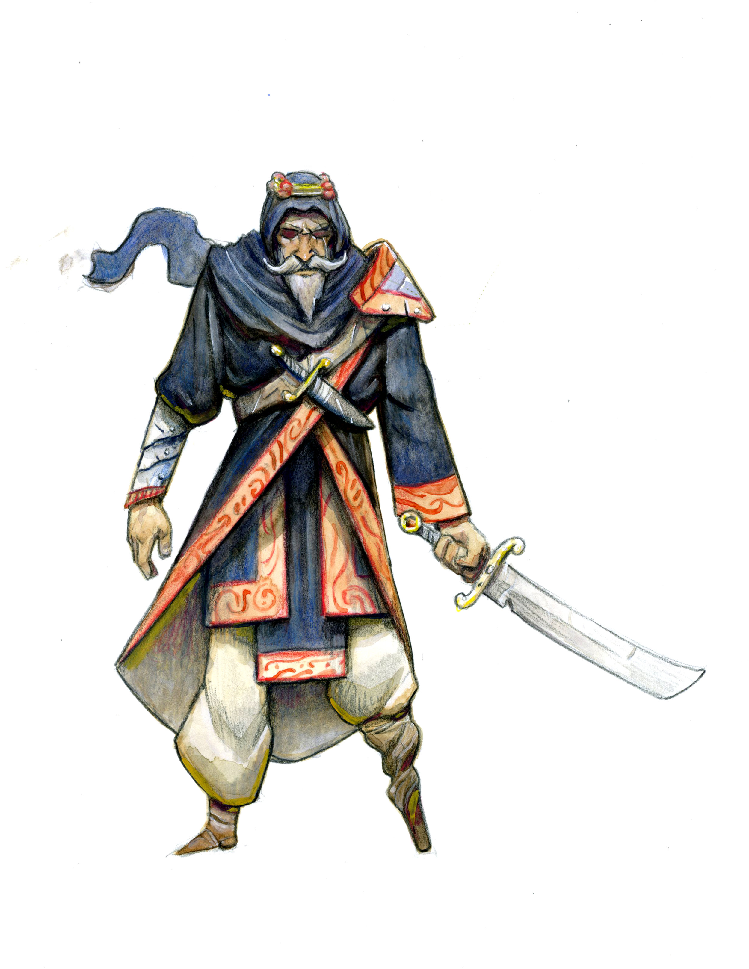
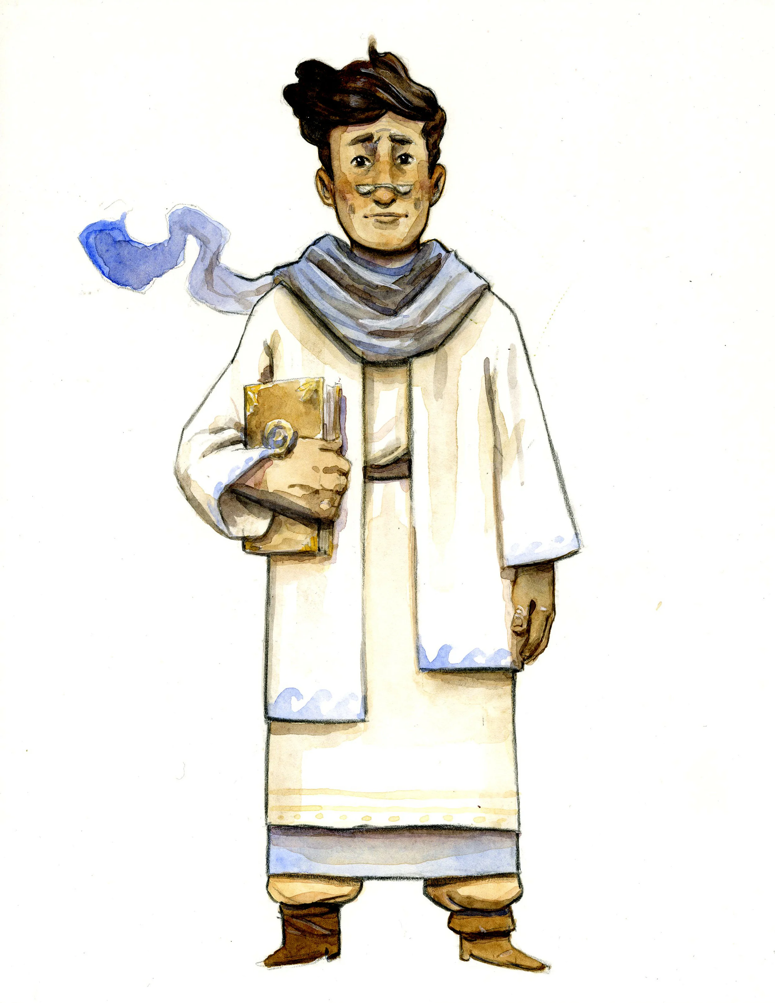
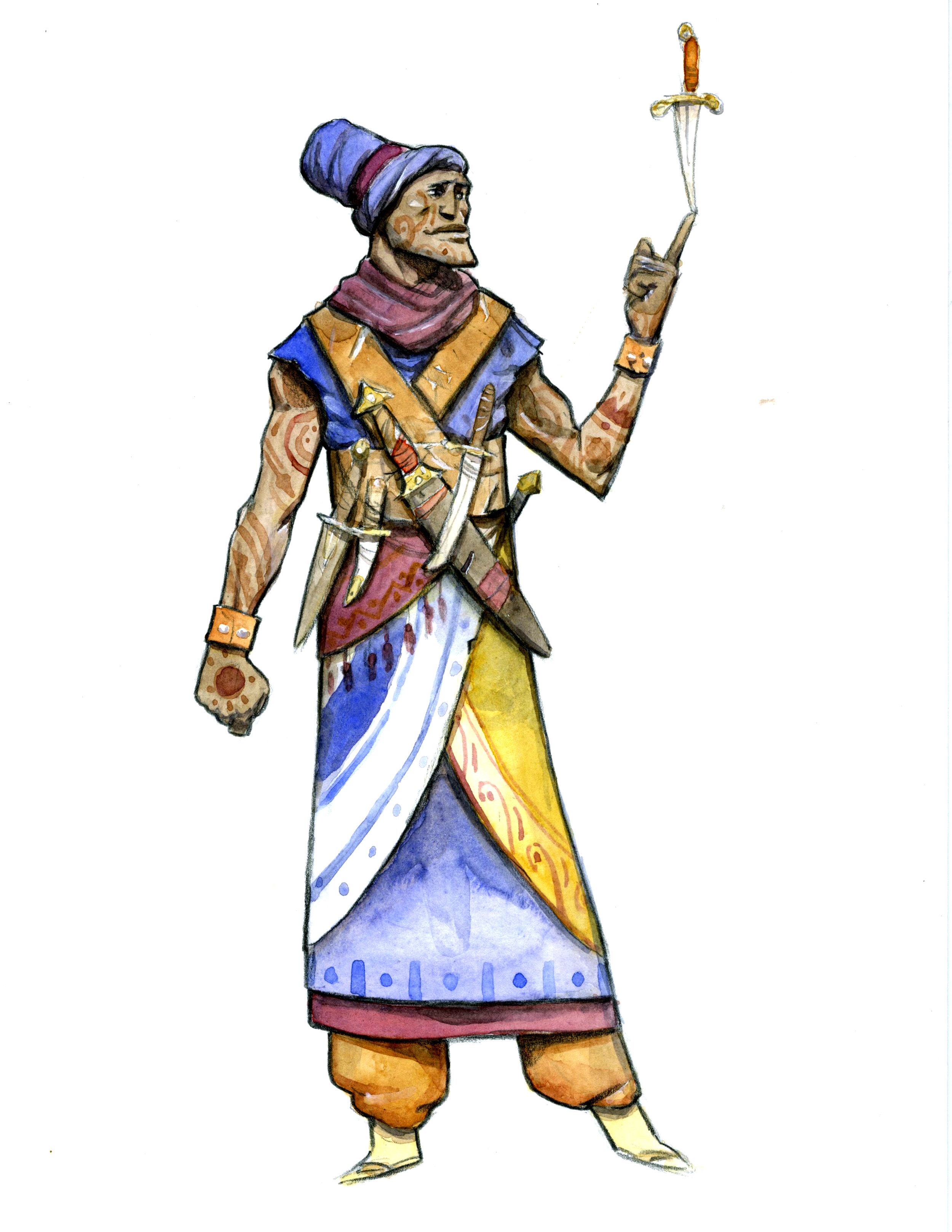
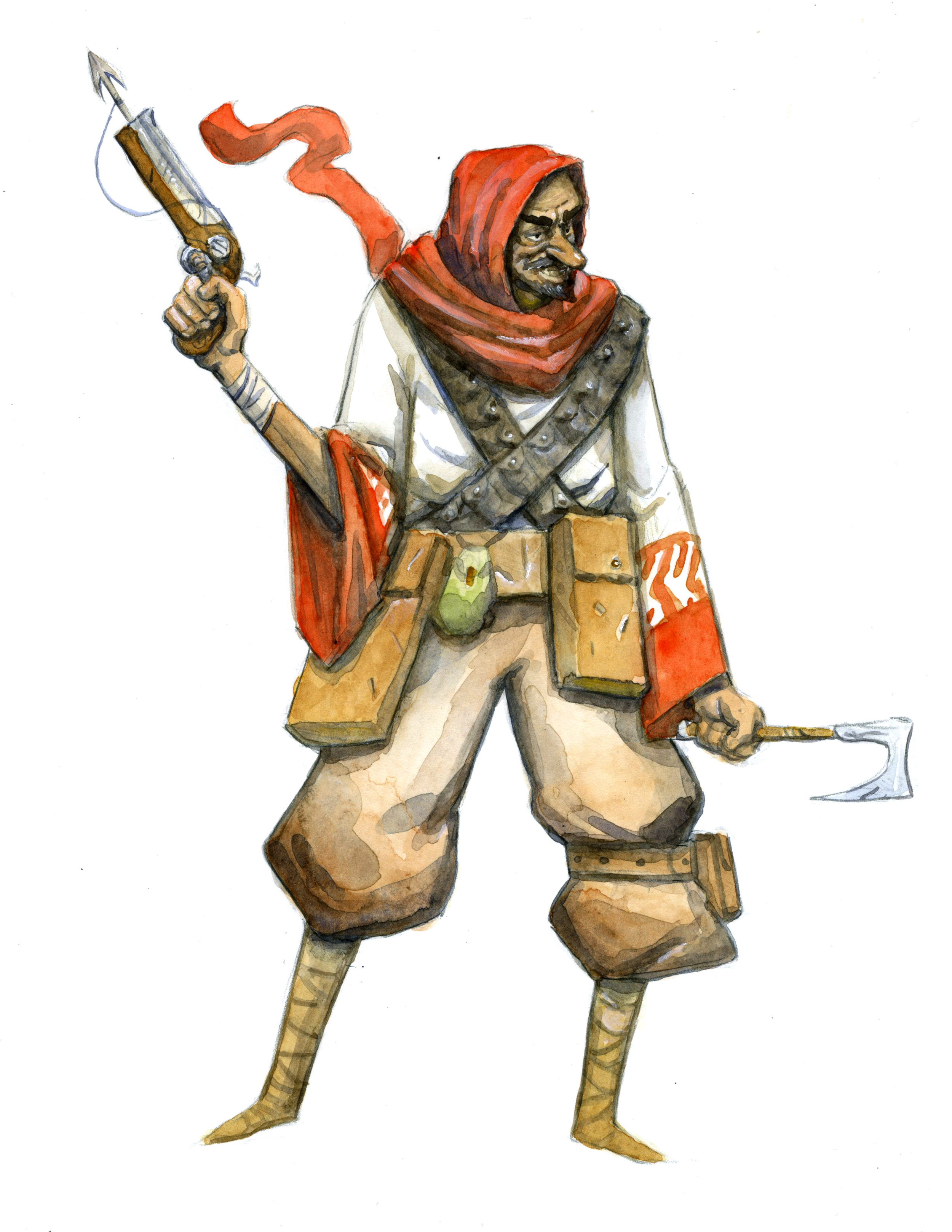
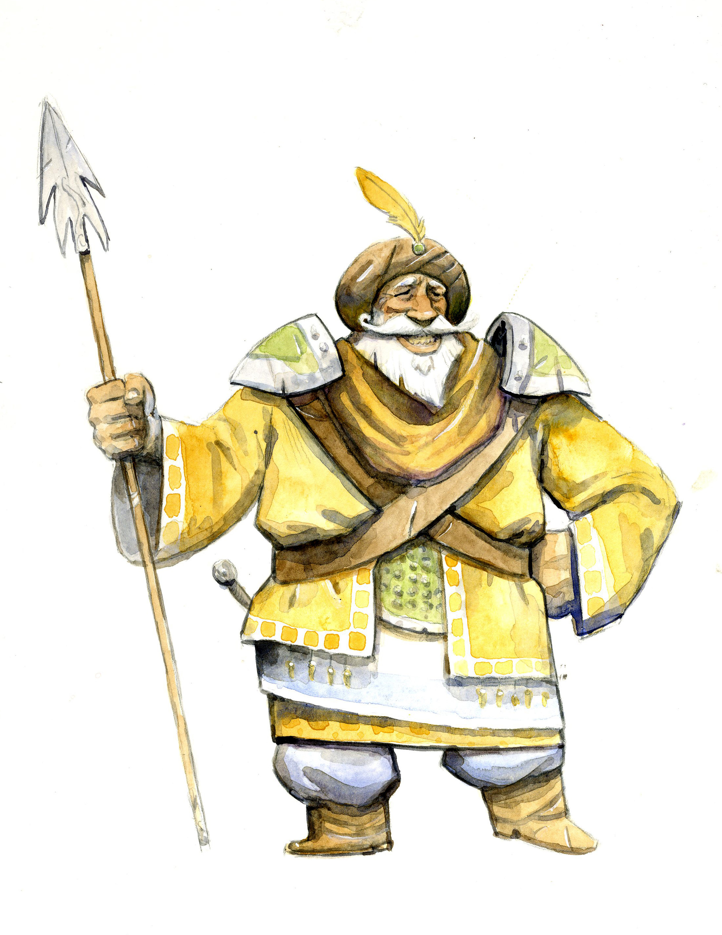
Once I finalized the poses, I printed each character out on normal printer paper, covered the back of each piece with graphite, then placed that (graphite down) on top of the watercolor paper I was using. I then traced over the character using a lot of pressure, and transferred the character onto the watercolor paper. I then tightened the drawing with black colored pencil, and I was set to paint. It took a loooooonnnnggg time, but I think they turned out okay. Watercolor is a tricky beast, but I hit some breakthroughs regarding my process, so the experience as a whole was less painful than past attempts. Here are the final designs:
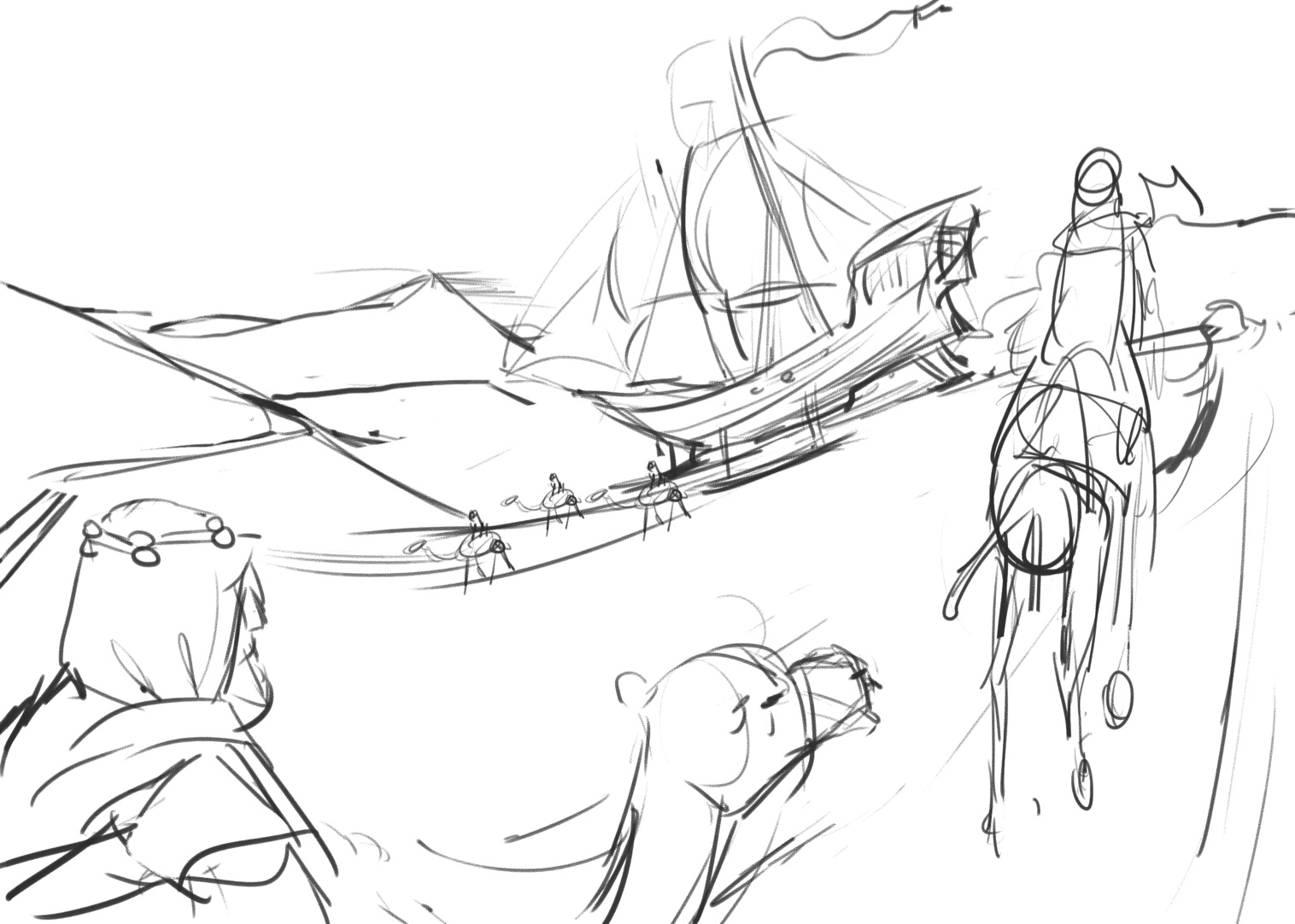
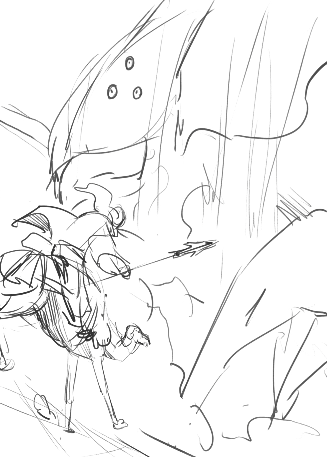
I applied several layers of local color before moving on to values, which is almost opposite of what I’ve done in the past. After establishing the color scheme of each character, it was just a matter of doing a million layers of value to get get some rich darks in there. While I was working on these guys, I was simultaneously developing the illustrations. I was a little bit intimidated by doing four full colored illustrations, so I made them just 5x7” which felt manageable. The cover was 8.5x11” which was a little more ambitious, but doable. I start my illustrations by doing thumbnails:
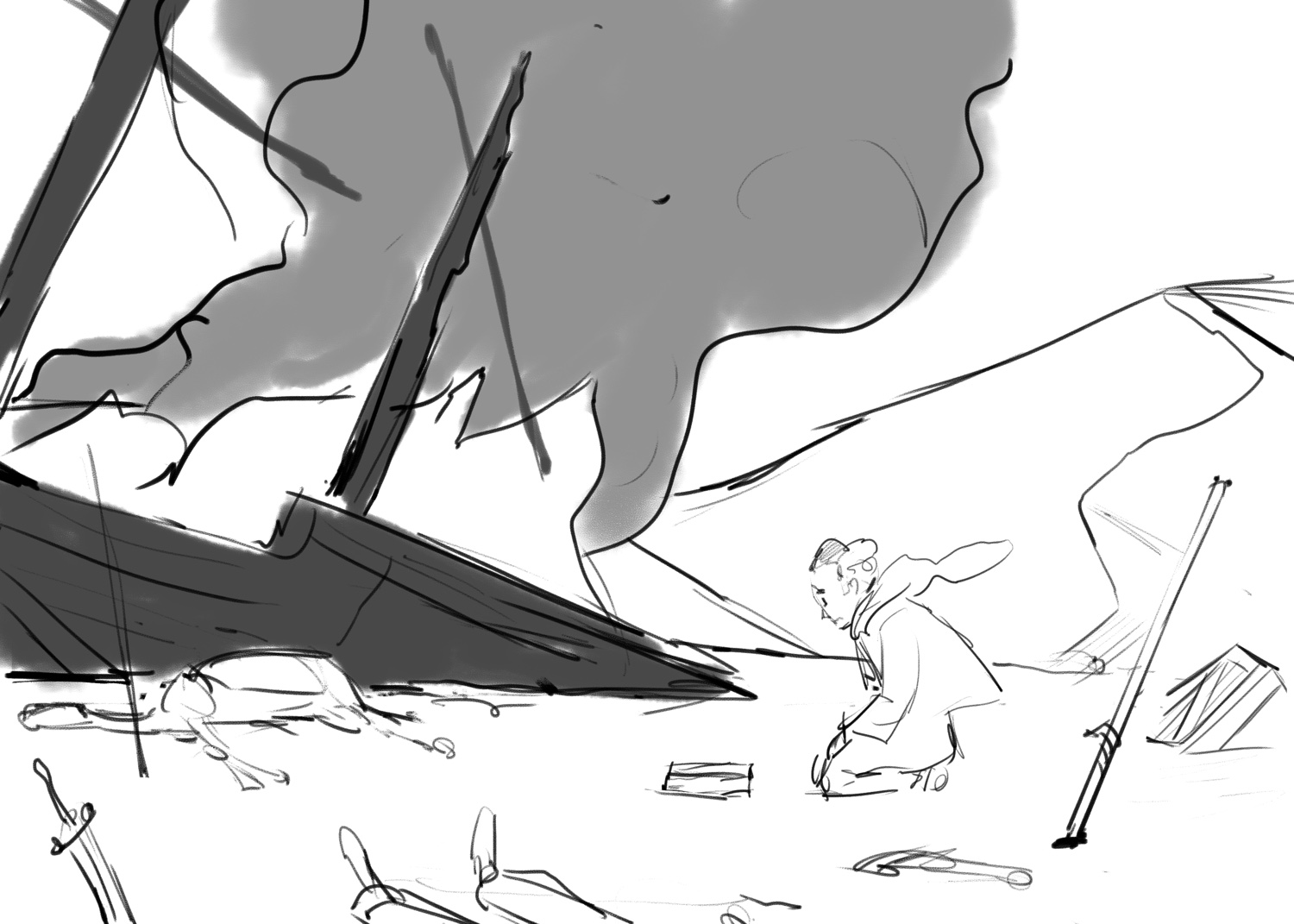
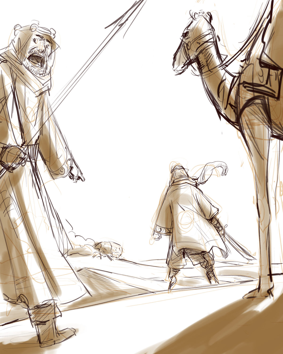
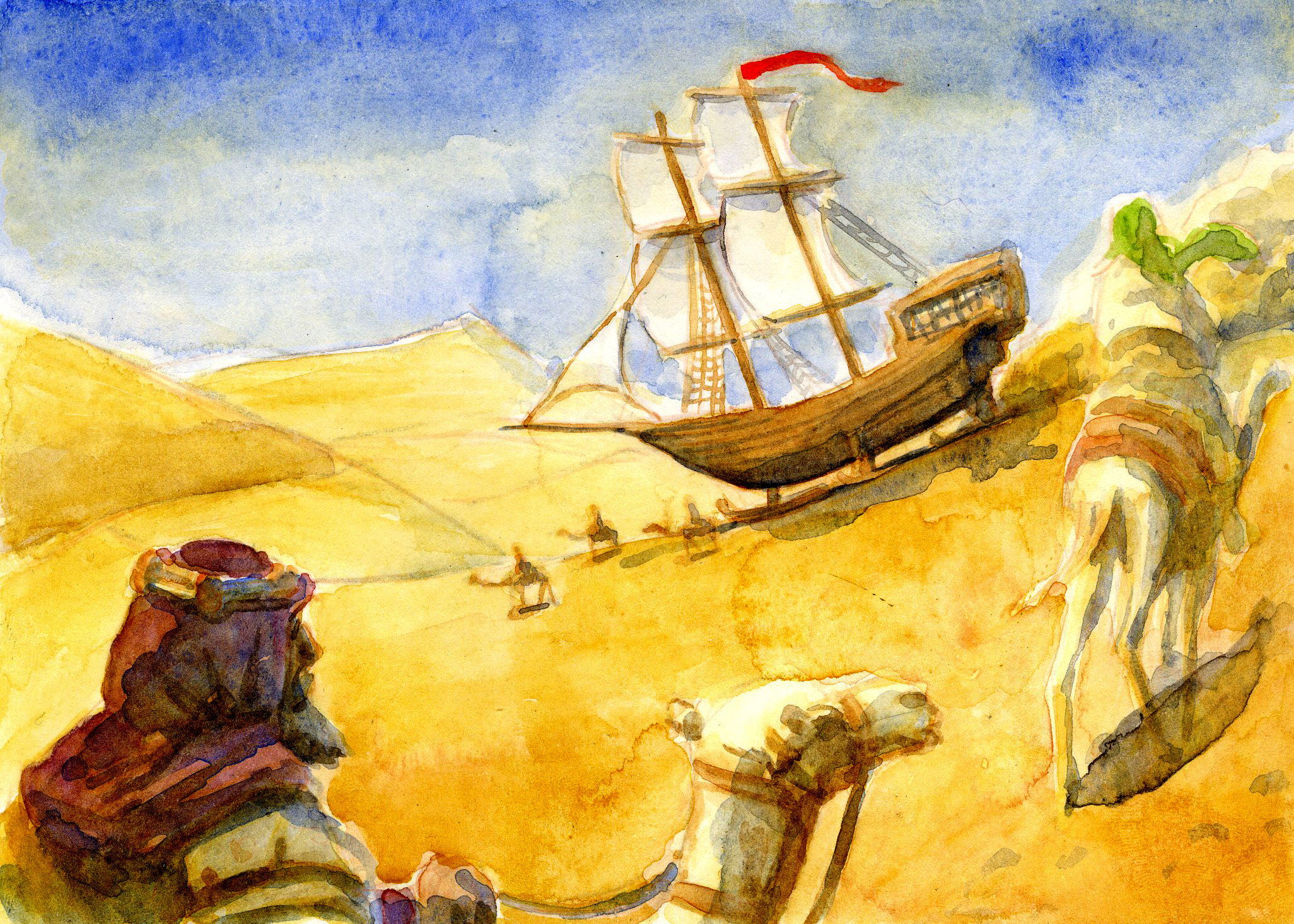
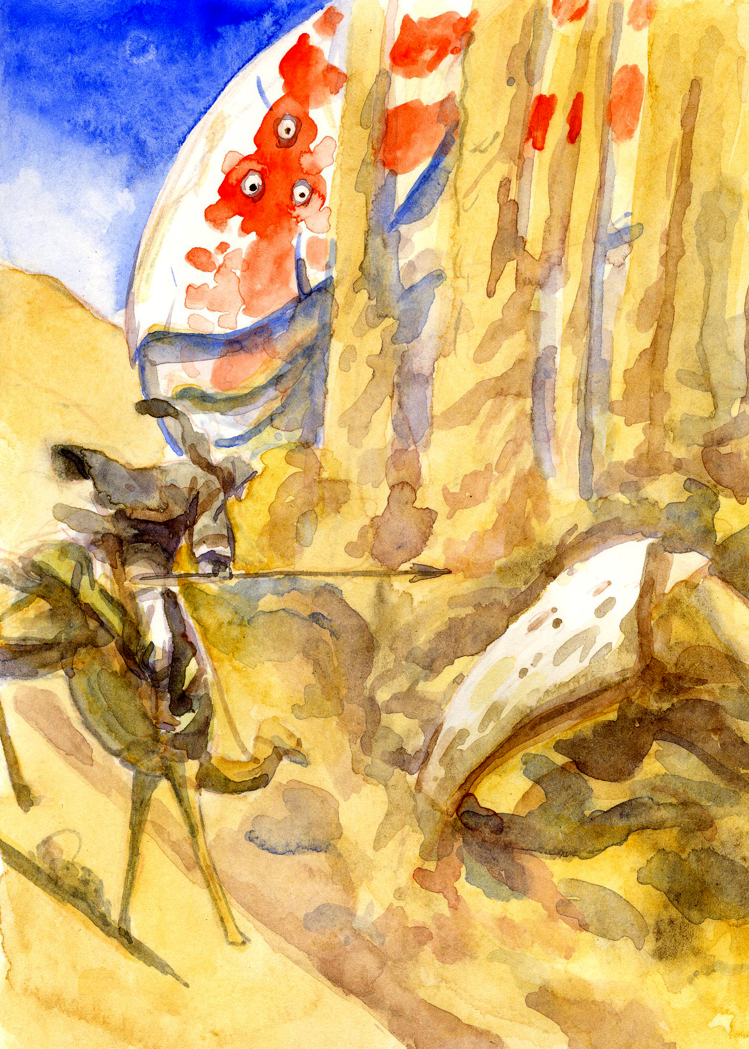
They’re little turds. Terrible, barely discernible drawings, but they serve their purpose in ruling out bad compositions and helping me figure out the best way to tell the story. I decided to illustrate them setting out on their journey, Ahab charging Moby, and the aftermath of the battle. Here are the roughs, followed by the finals:
I transferred these to watercolor paper the same way I did the characters.
The trick with the cover illustration was to leave room for text, while maintaining a solid composition. I haven’t gotten around to designing the whole cover yet, but I’d like to at some point.
So there you go! It was a super fun project, and I hope I managed to capture at least some of that feeling of adventure and scope that the stories of Moby Dick and Lawrence of Arabia have evoked in me. I feel like I definitely discovered some things during this which will be helpful in the future. Glad to be done though. I’m owning summer. Let me know if you have any questions or comments in regards to my process or art. I’d love to chat!
Peace,
AP

